Prompt Playbook: Become a Content Marketing Machine PART 5
It opens up new social channels - specifically Instagram.
It gives us additional assets to use alongside the other formats.
The first is relatively straightforward - your images become the post on Instagram. Add the post text we created previously as the caption et voila you have hit another channel. More exposure, more audience, more revenue.
The second is a little more complex but equally powerful. You can get more creative here.
For instance, you’ll notice that my newsletters include a hand drawn image. It’s another layer of content to reinforce the written long form content.
We also drop the images into social posts like this LinkedIn carousel
This makes it multimedia in the truest sense - there’s a text post, a carousel with text and a graphic.
I also use the images as backgrounds in video posts.
How to produce graphics
Here’s my biggest tip - do your graphics by hand.
I can’t claim any credit for this. I straight ripped it from Greg Isenberg.
Here is one of his
Notice the 155k views? Powerful stuff.
Is it highly produced? Nope!
In fact it looking so basic is why it works.
It “stops the scroll”. People stop to see what it is.
That doesn’t happen if your graphics are highly polished. No-one cares about corporate looking imagery. We see so much of it on the daily that our eyes glide right over it.
So put down Photoshop/Canva and get your pens.
Hand drawn feels like we’re physically sitting with a mentor who is sketching out her ideas for you on a napkin.
I “stole” the idea from Greg and started doing similar graphics for the newsletter. Further proof this method gains attention? A few days later Greg actually featured one of our graphics in his post:
The graphic on the right? That’s one of ours. That post is sitting at a cool 100k views.
Would he have featured it if it had been a written post? Nope.
How to design your graphics
I wish I could tell you there’s an AI tool that’ll do this graphic for you.
There ain’t.
But we’ll use AI to give us ideas for the design.
Here’s a prompt
Act as a graphic designer

I need a simple line drawing graphic that represents the concepts in the following post

Describe the graphical elements. Do not generate it

Use the graphics of Dan Koe as inspiration

The graphic should be possible to draw by hand - focus on simple geometric shapes, lines and text

[copy/paste post]
I plugged in this post from the last Part ""Your voice, your brand, your impact. Start expressing, the world is ready to listen."
This super simple post led to this graphic suggestion
and some style guidelines
That’s sufficient for you to hand draw the graphic.
I can’t emphasise this enough - keep it simple! Your artistic ability isn’t important here, just use simple lines and shapes.
If you have trouble visualising the instructions you can ask ChatGPT to produce a version
I wouldn’t personally use this graphic straight from ChatGPT but it’s a good way to give you a reference image to then create an image.
This can inspire you to draw your own diagrams
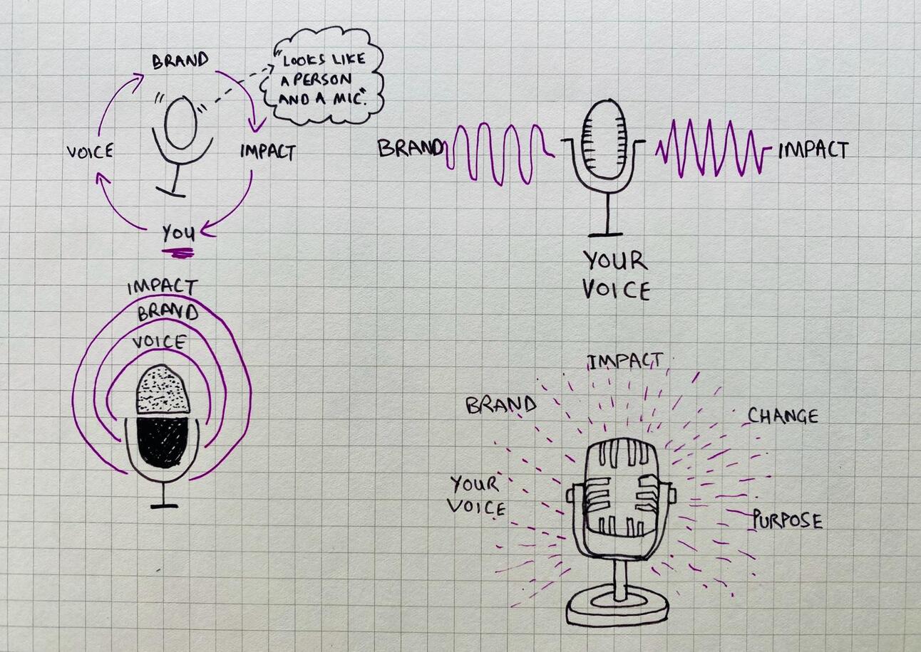
Sketches inspired by ChatGPT version
Premium Prompt - Coloured Pencils
It’s important to make a mark with your brand.
As well as developing these graphics I recommend working on brand consistency.
Here are some tips
Colour
Super basic but choose a colour and stick to it.
I made light of this this week on X but it’s important
We use purple in our graphics but also elsewhere. Notice how this newsletter email start with 🟣? That makes it easy to pick out in your inbox.
I’d dye my hair purple if my partner wasn’t so against it.
It’s for the brand honey!!
Watermark/Profile
On each of your images drop your social handle. You’ll notice that all mine have @iamkylebalmer on them.
That’s another brand touchpoint.
It’s especially helpful when the images get shared because it means they always point back to me.
Background
Keep it consistent.
We use square graph paper.
Why? Makes it easy to draw proportionately on and also has a “sciencey” feel to it.
Choose a background that makes sense. Something familiar to your audience.
You publish content for writers and authors? Use yellow lined legal pad.
Publish for artists? Try a high quality paper where grain is visible.
Entrepreneurs? Use napkins or literally write on the “back of the envelope”.
Don’t just pick up the closest paper. Choose one type and stick with it.
Pulling it together
Over this week we’ve cascaded content from one format to the next.
Following this framework will let you produce huge amounts of content from a single idea.
You no longer have an excuse to not be creating. One idea leads to 20+ content pieces now.
Here’s a reminder of what we covered this week
Part 1: Never ending story
Part 2: First go long
Part 3: Break it down
Part 4: Video overlay
Part 5: Getting arty
Keep prompting,
Kyle