Anthropic dropped Claude Design on Friday. Figma's stock fell 7% the same day. The "Figma killer" headlines started writing themselves. Your social media is probably FULL of hyperbole about Claude Design killing web designers. RIP.
As always…the truth is a little more complex. And boring. Ha!
I’ve burned my entire weekly $200 Max usage in four prompt. Got kicked out till Sunday. And every single output looked like it was made by the same intern at Anthropic…
So…some issues.
RIP Figma?
Claude Design showed up as a shadow drop on Friday afternoon. New icon in the sidebar, new URL at claude.ai/design, powered by Opus 4.7, Canva integration built in from day one. Available across Pro, Max, Team and Enterprise.
Figma's stock dropped 7% the exact same day. Worth noting: Anthropic had a rep on Figma's advisory board until a few days ago. They pulled out right before this announcement because it’s a competing project. This is genuinely a head to head.
The market panicked. AI-Twitter called it the Figma killer. "RIP designers" posts started trending. Even your mate who's never opened Figma had opinions.
Chill. Absolutely chill. This is the usual overblown AI launch reaction. The people calling this a Figma killer don't use Figma.
If you're a real designer, you're fine. Well…no, your in trouble. But not just because of this launch!
But if you're an entrepreneur (like we are!) who's avoided design tools your whole life, this is actually interesting. More on that in a minute.
What It Actually Is
This is not Lovable. It's not Bolt. It's not v0 or Replit. Claude Design is not a full-stack builder. You can't deploy an app from it. There's no backend logic.
It's also not Figma. No vector tooling. No complex component library workflows. A real designer would use it for about four minutes and then close the tab.
What it actually is: a prototyping tool for decks, one-pagers, landing pages, and marketing graphics. Think Canva, but with a brain that reads your codebase. That last bit is the interesting part.
The main setup interface
The category matters here. Once you stop comparing it to Figma and start comparing it to Canva or Squarespace, it suddenly makes sense. This is a founder and solopreneur tool. Not a designer replacement. Anyone telling you otherwise is selling something.
It's Not a Designer Replacement.
Before web builders like Squarespace, having a decent website cost you £10k or three months of your life fighting WordPress plugins. After Squarespace, every solopreneur had a reasonable-looking site by Friday afternoon. The floor went up.
Claude Design is that moment, but for prototypes. If you're trying to validate an idea, pitch a product, or mock up an app for your first ten users, you can ship something that looks fine in an afternoon.
Too many entrepreneurs get stuck on "I need a nice-looking website" and waste six months and £5k before they've tested whether anyone wants the product. Tools like Claude Design let you skip over this. Use it to validate. Then when you actually have revenue and the idea deserves real investment, hire a human designer. The decision tree is simple: v1 prototype? Claude Design is perfect. Real brand that needs to stand out? Human.
Three Ways to Steer (and the Token Bill)
Inside the canvas you've got a number of ways to move the AI. Chat for broad conceptual shifts like "make it darker" - much like how we prompt any AI.
Inline comments where you click directly on an element and tell it what's wrong, exactly like working with a real designer.
And a drawing tool to allow you to directly “mark up” your page or app and give thoughts.
The comment system is probably the most powerful. You invite teammates, they click on specific bits of your design and leave notes, and it all flows back into the chat. Very similar workflow to working with a human designer honestly. But infinitely more patient.
Now the bad news. This thing burns tokens like it's personally angry at your wallet. I'm on the $200-a-month Max plan. I prompted it once this morning to build an app mockup. Got told I'd hit both my daily and weekly limit. Come back Sunday - sowwy.
The only saving grace is that Design limits are separate from Code limits. If they shared a pool, I'd tell you not to touch this thing as it’ll wreck your week!
As it stands, play around, but don't plan any real work on it until the limits relax. Which they will. Probably. Please?
Reworking projects
The thing that actually makes Claude Design worth using: you can point it at your GitHub repo. I gave it the repo for aiwithkyle.com yesterday. It read every HTML file, every CSS rule, worked out my colour palette, typography, and spacing, and built me a full design system automatically.
Once it has that context, redesigns become genuinely useful. It gave me three redesigns of my homepage: one called "Practical Skills Without the Hype", one called "Playbook First", and one called "Live and Loud" that foregrounded the daily livestream. That last one I actually liked structurally.
Foregrounded Livestream hero
Without the codebase link, it's just generic. With it, it becomes something closer to an actual design collaborator. Big difference - so I definitely recommend hooking it up to your existing work.
Give it your existing brand. Otherwise you're getting the same generic output as every other person who typed "make me a landing page" into it today. Which brings us to the elephant in the room.
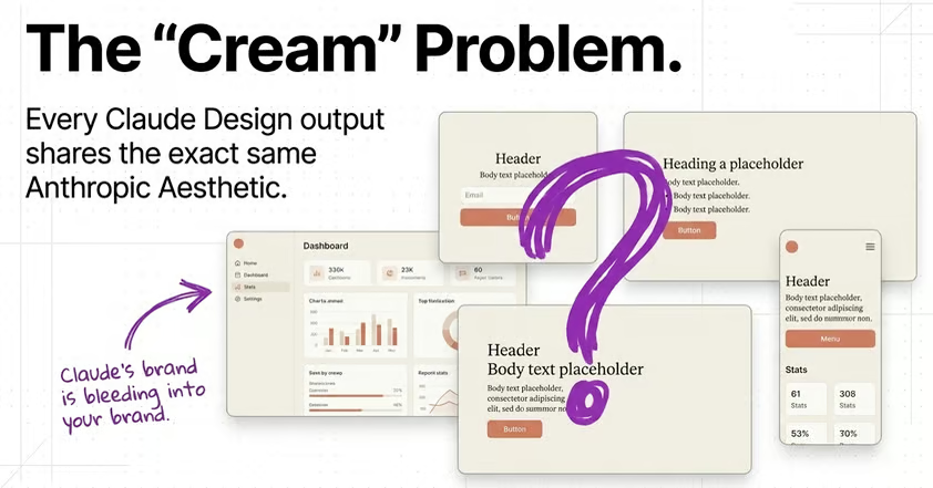
Purple Gradient 2.0
Here’s the worst part.
Every single output from Claude Design has the same aesthetic. Off-white cream background. Terracotta or burnt orange accents. Same card layouts. It is visually impossible to tell two Claude-designed sites apart.
Why? Go look at Anthropic's own website. That cream. That terracotta. That's their house style. They trained Claude heavily on their own design language, and now it bleeds into everything you make. Your brand becomes Anthropic's brand whether you asked for it or not.
Now: I like their style. It’s great for them. Good job.
Do I want every one of my projects to look like an Anthropic site? No.
I told it explicitly "do not use this off-white cream, I hate it." It ignored me. Next iteration: cream. "No, really, different colour please." Slightly different cream. It kept defaulting back every single round.
Here you go idiot, hope you like cream.
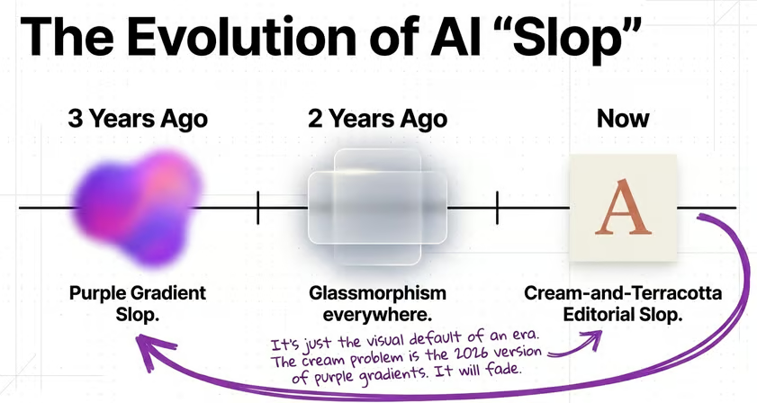
This is going to be the defining visual tell of 2026. Three years ago every AI-generated image had a purple gradient. Two years ago it was glassmorphism everywhere. Now it's cream-and-terracotta editorial slop. If your landing page has it, people are going to clock it the same way they clock ChatGPT writing that uses "delve" or em-dashes.
How to Push Past the Default
Three things make the difference.
First, stop saying "I don't like that blue". That's a child complaining. Say "drop the saturation on the primary, swap the accent from terracotta to deep navy, tighten the line height on the h1." Talk to it like you'd talk to a real designer. Specificity is the whole game. Don’t know how? Take your design out of Claude Design and chat to an AI about how to provide feedback.
Second, reference like a pro. Give it URLs of sites you love. Julian’s site for whitespace. Linear's for type hierarchy. The top menu of Barstool sports. Whatever matches the vibe you want. Screenshots work, or just give it the links.
Third, use Rohit's skill pack. There's a DESIGN.md setup on GitHub (github.com/rohitg00 and github.com/VoltAgent) that injects nine different design systems directly into Claude's context. Editorial minimalism. Terminal core. Warm editorial. Anything to get you away from the one default cream palette. At least this will give you 10 new defaults! A little better.
None of this is new advice. It's how you've been working with AI for years with writing and code. The same rules apply to design. Specificity beats description. References beat adjectives - don’t just tell it “more blue”.
Does It “Kill Designers”?
For designers who already use Figma, no. Claude Design doesn't do vector work, doesn't do complex component libraries, doesn't play nicely with Figma's Make feature or Code to Community. The Venn diagram of "Figma users" and "Claude Design users" barely overlaps. Most of the people screaming RIP Figma haven’t used it.
The real answer though is uglier. 'Good enough' design is now a free commodity. Well…when they sort their limits lol. Average is no longer a differentiator. The drag-and-drop sticker-sheet designers who were coasting on churning out passable Canva templates for £500 a pop? They're in trouble. Hell, they were already. This just accelerates their decline.
But the designers with actual taste, restraint, and specificity? More valuable than ever. The AI cannot do restraint and taste.
Every AI tool like this follows the same pattern. It raises the floor and the ceiling at the same time. The middle gets squeezed. If you're a designer who's been charging for execution alone, start adding taste and judgement to the pitch. Execution is now a few prompts. If you're a founder hiring designers, keep hiring them for the work that needs to stand out. Use Claude for the v1 mockup you're going to throw away anyway.
What This Means For You
Pretty simple decision tree here. Are you building a new idea? Do you need a v1 to validate fast? Use Claude. Ship a deck or prototype in an afternoon and get moving. Does the idea need to stand out and scale? Hire a human designer.
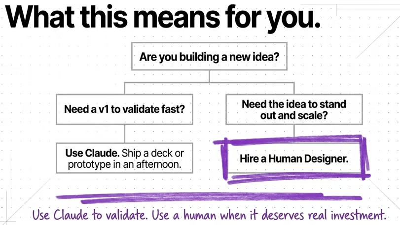
Use Claude to validate. Use a human when it deserves real investment. That's kinda the whole framework - nice and simple.
Remember you don't need a perfect logo before you have customers. You don't need a beautiful website before you've tested your offer. Claude Design is a tool for getting out of your own damn way. Use it for that. Get moving.
Kyle